
Visual storytelling is more than making a beautiful image. It’s about creating tension that makes people stop and think. In a feed full of polished pictures, beauty alone rarely holds attention. What does is contradiction: something playful about a heavy topic, a gentle colour on a sharp shape, a strange character in an ordinary room. Designing with these dualities gives an image a story before a single word is read.
Why contrast works
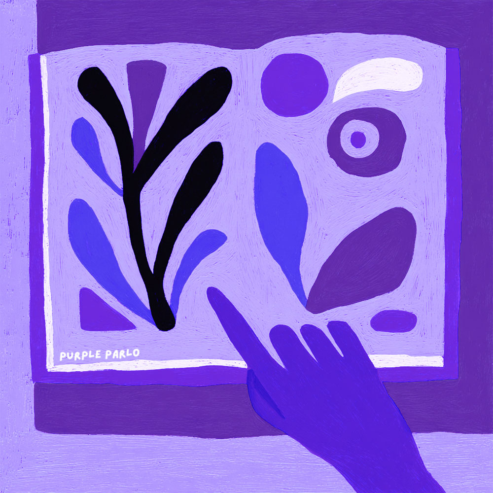
People are full of contradictions. We want stability and change, closeness and space. Images that hold two opposite qualities at once feel true to that experience. They also create a small puzzle the viewer wants to solve, which keeps them looking. The idea of juxtaposition, placing different things side by side, is one of the oldest tools in art.
Dualities I use often
- Playful and serious: soft, cute shapes for a difficult subject like anxiety or trauma.
- Order and chaos: a symmetrical frame holding scattered pieces. See Symmetry in Trauma Art.
- Alien and familiar: a strange figure in an everyday setting.
- Minimal and expressive: few shapes, strong emotion.
- Light and dark: a pale figure against a deep purple ground.
The outsider as a story device
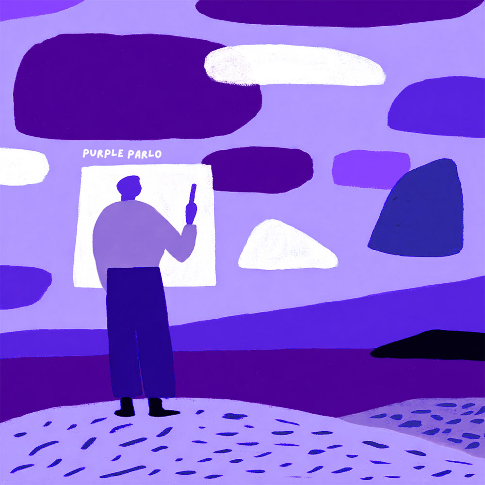
One duality I return to is insider versus outsider. Many neurodivergent people describe life as visiting a foreign planet. In my illustrations, alien-like figures stand in for that feeling. Instead of a source of shame, the outsider becomes a lens: someone who notices what insiders miss. I wrote about it in Drawing from the Outside.
Bold minimalism keeps it readable
Contrast only works if the viewer can read it quickly. Too many elements and the tension gets lost in noise. I keep compositions simple: a few strong shapes, clear negative space and a limited palette. Each line is there on purpose. That makes the duality the first thing people notice.
Using dualities for brands
For brands, especially in wellness and mental health, contrast helps content feel thoughtful rather than generic. A gentle, slightly strange illustration on a serious topic says “we understand this is complicated”. That builds trust. Google also favours original content with real expertise in its helpful content guidance, and custom images are part of that.
Try it yourself
- Pick the main feeling of your story. Write it as one word if you can: grief, curiosity, relief.
- Find its opposite.
- Give one to the subject and the other to the style. For example, a heavy subject in light colours.
- Simplify until both qualities are obvious at a glance.
Frequently asked questions
Can contrast feel disrespectful on serious topics?
It can if it mocks the subject. Done with care, playful style makes hard topics more approachable without making light of them.
Does this work for packaging?
Yes. A memorable contrast helps products stand out on shelves. See Product Branding Narrative.
See dualities in action in my portfolio, or contact me to discuss a collaboration.
Wish You a Purple Day!