
The authentic neurodivergent experience rarely shows up in stock imagery. Search for “autism” or “ADHD” on a stock site and you get puzzle pieces, rainbow brains and models holding their heads. Those images don’t show what masking, sensory overload or burnout actually feel like. People who live with those things notice the gap immediately.
This post looks at why generic visuals fail neurodivergent audiences and what illustration can do instead.
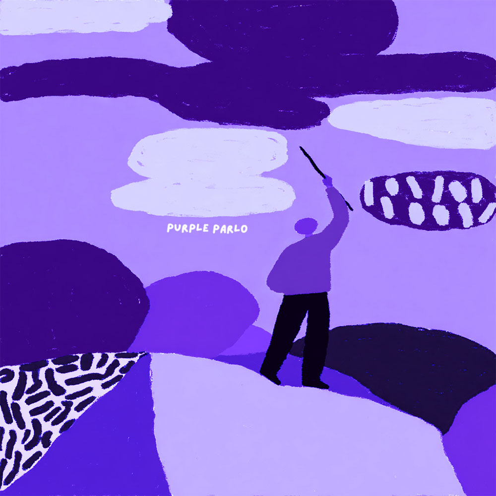
What generic imagery gets wrong
- It shows labels, not experience. A puzzle-piece logo says “autism” but tells you nothing about how a busy supermarket feels.
- It flattens everyone into one look. Neurodivergence covers autism, ADHD, dyslexia and more, and each person’s experience differs. The neurodiversity idea itself is about that variety.
- It often comes from outside. Images made without lived input tend to show what neurodivergence looks like to observers, not to the person.
Showing the invisible parts
Much of neurodivergent life is internal. Masking, the effort of hiding natural reactions to fit in, is invisible by design. So is the slow build-up of sensory input over a day. Illustration can make those states visible through metaphor:
- a calm face drawn as a mask, with a different expression showing at the edges
- a figure standing still while the room around them fills with sharp, crowded shapes
- a battery-like body slowly emptying through the day
I call my own set of these symbols the Alien Dictionary: a growing vocabulary of shapes and characters for feelings that don’t fit standard words.
Pattern recognition as a strength
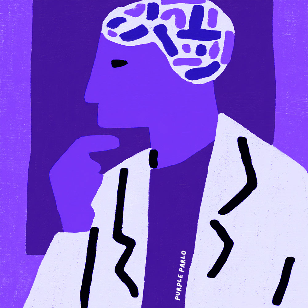
Many neurodivergent people notice patterns and details others skip. In illustration that becomes an asset: consistent symbols, careful composition and a tight colour palette. My work leans on purple, symmetry and simple bold shapes, because a clear structure helps both me and the viewer read a complicated feeling.
Why it matters for organisations
Clinics, charities and educators who serve neurodivergent people build trust when their visuals ring true. A reader who sees their real experience drawn with care is more likely to keep reading, sign up or book an appointment. Google’s own advice on creating helpful, people-first content points the same way: original material made with real experience serves readers better than generic filler.
How to brief an illustrator on neurodivergent topics
If you are commissioning images for neurodivergent readers, a good brief saves time and avoids clichés. Include these points:
- The specific experience you want to show, such as shutdown after a long day or the effort of a phone call, rather than a diagnosis name.
- Who will see it: adults, teenagers, parents, clinicians or employers. Each needs a different tone.
- Words to avoid. Many autistic adults prefer identity-first language (“autistic person”), while others don’t. Check with your community.
- Imagery to avoid, like puzzle pieces, broken brains or faces of distress used as decoration.
- Where it will appear: a website, a printed leaflet, social media or a slide.
The National Autistic Society has helpful guidance on language and representation if you want a reference point. A short call before sketching also helps me ask the questions a written brief misses.
Done well, these images tell readers that the people behind the content listened before they drew.
Frequently asked questions
What is masking?
Masking means hiding or suppressing natural behaviours to appear neurotypical, such as forcing eye contact or copying social scripts. It is tiring and often leads to burnout.
Can illustration avoid stereotypes?
Yes, if it focuses on specific feelings and situations rather than symbols for a diagnosis. Involving neurodivergent people in the brief helps too.
Do you work with organisations on this?
Yes. See my portfolio for examples or contact me to talk about a project.
Wish You a Purple Day!